
サンプル1
SVGで曲線を表現しました。
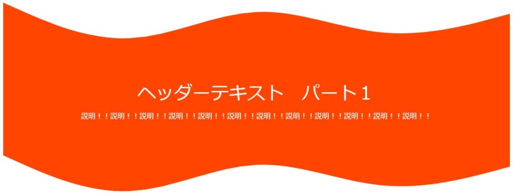
サンプル1のHTML
<div class="hdtype01">
    <svg class="hdtype01_upper" xmlns="http://www.w3.org/2000/svg" viewBox="0 60 1440 260"><path fill="#ff4500" fill-opacity="1" d="M0,96L60,122.7C120,149,240,203,360,197.3C480,192,600,128,720,122.7C840,117,960,171,1080,181.3C1200,192,1320,160,1380,144L1440,128L1440,320L1380,320C1320,320,1200,320,1080,320C960,320,840,320,720,320C600,320,480,320,360,320C240,320,120,320,60,320L0,320Z"></path></svg>
    <h1>ヘッダーテキスト パート1</h1>
    <p>説明!!説明!!説明!!説明!!説明!!説明!!説明!!説明!!説明!!説明!!説明!!説明!!</p>
    <svg xmlns="http://www.w3.org/2000/svg" viewBox="0 0 1440 320"><path fill="#FFFFFF" fill-opacity="1" d="M0,96L60,122.7C120,149,240,203,360,197.3C480,192,600,128,720,122.7C840,117,960,171,1080,181.3C1200,192,1320,160,1380,144L1440,128L1440,320L1380,320C1320,320,1200,320,1080,320C960,320,840,320,720,320C600,320,480,320,360,320C240,320,120,320,60,320L0,320Z"></path></svg>
</div>
サンプル1のCSS
.hdtype01
{
    background-color: #ff4500;
    color: white;
    text-align: center;
}
.hdtype01 h1
{
    margin: 0;
}
.hdtype01 p
{
    margin: 1rem 0 0 0;
}
.hdtype01_upper
{
    background-color: white;
}
サンプル2
SVGで斜線を表現して、transformでテキストを加工しました。
更にtext-shadowで文字を縁取りました。
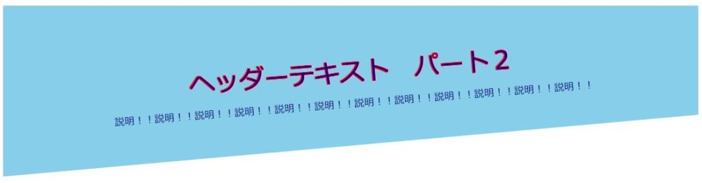
サンプル2のHTML
<div class="hdtype02">
    <div class="hdtype02_text">
        <h1>ヘッダーテキスト パート2</h1>
        <p>説明!!説明!!説明!!説明!!説明!!説明!!説明!!説明!!説明!!説明!!説明!!説明!!</p>
    </div>
    <svg xmlns="http://www.w3.org/2000/svg" viewBox="0 120 1440 200"><path fill="#ffffff" fill-opacity="1" d="M0,256L1440,128L1440,320L0,320Z"></path></svg>
</div>
サンプル2のCSS
.hdtype02
{
    background-color: skyblue;
    color: darkblue;
    text-align: center;
}
.hdtype02_text
{
    padding-top: 80px;
    transform: rotate(-4.5deg);
}
.hdtype02 h1
{
    margin: 0;
    text-shadow:1px 1px 0 #f00,-1px 1px 0 #f00,1px -1px 0 #f00,-1px -1px 0 #f00;}
.hdtype02 p
{
    margin: 1rem 0 0 0;
}


コメント